Interactive and Multimedia Learning!



By Group D:
Members: Liam Calder, Swoyam Rajbhandari, Serena Sing, JungJoo Yoon
Hello everyone! This week, we will dive into the topic “Basics of Python Programming”. It is an essential building block for anyone who is new to Python coding. Our lesson covers the following:
We have prepared many learning materials, activities, and quizzes that will help solidify your knowledge of basics of Python programming by the end of this lesson!
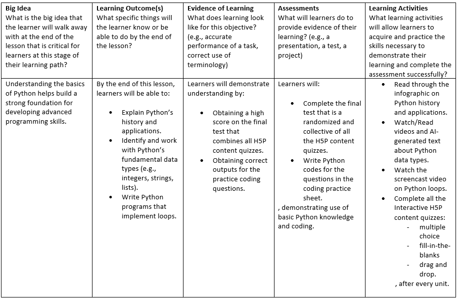
The following is the lesson plan we created as the format for our lesson:
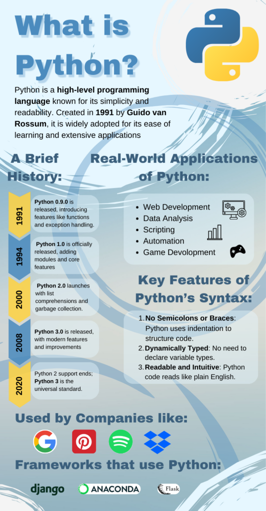
The following is an infographic on an introduction to Python, its history and features, and applications:
Now that you have gone through the infographic, let’s do a short activity that will test you on what you have learned so far.
The following is a multiple-choice quiz on the content so far:
The following is a video on Python Data Types:
Telusko. “#10 Python Tutorial for Beginners | Data Types in Python.” YouTube, 5 July 2018, www.youtube.com/watch?v=gCCVsvgR2KU. Accessed 29 Nov. 2024.
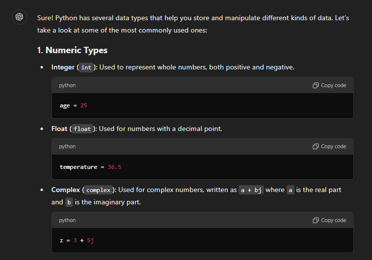
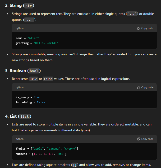
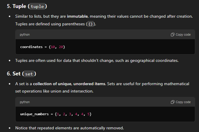
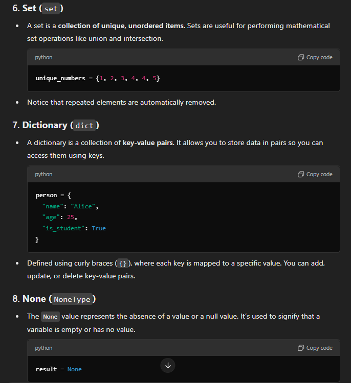
The following is AI-Generated text using ChatGPT on Python Data Types, based on the prompt, “Explain python data types for beginners”. It provides information on Python Data Types.
“Explain python data types for beginners” prompt. ChatGPT, 29 Nov. version, OpenAI, 1 Dec. 2023, chat.openai.com/chat.
The following is AI-Generated text using ChatGPT on Python Data Types, based on the prompt, “Show me code that provides an example”. It provides example code for Python Data Types.
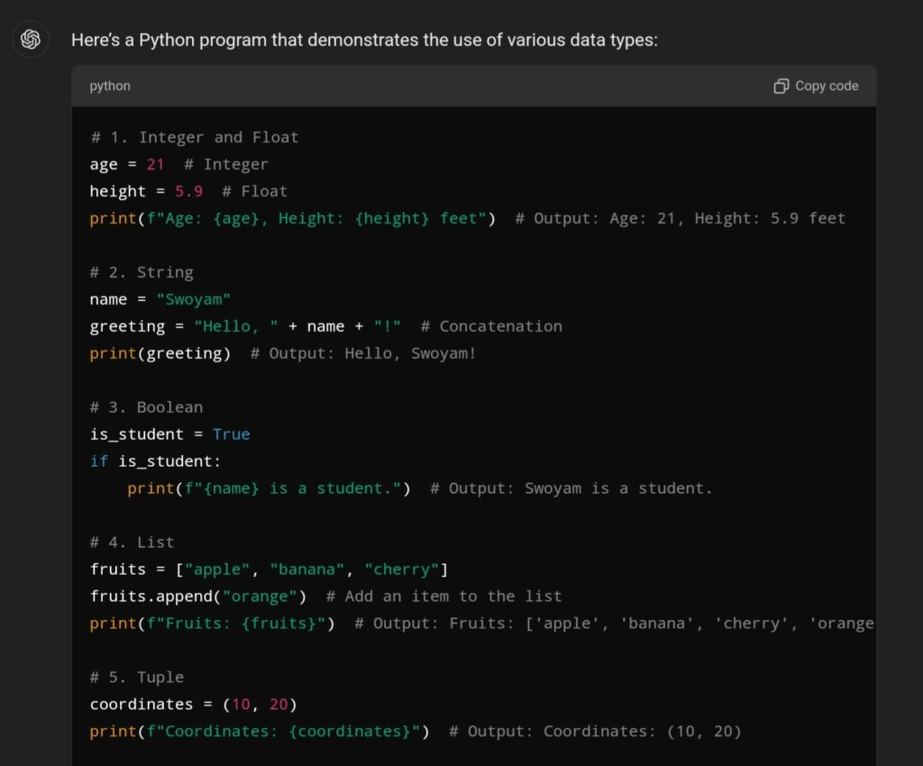
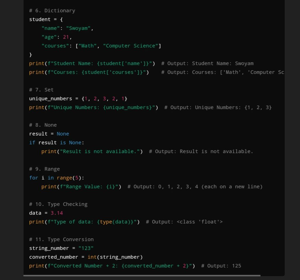
“Show me code that provides an example” prompt. ChatGPT, 29 Nov. version, OpenAI, 1 Dec. 2023, chat.openai.com/chat.
Now that you have gone through the videos and texts, let’s do a short activity that will test you on what you have recently learned.
The following is a multiple-choice quiz on the recent content:
The following is a video that introduces Python loops, their functions, applications, and how they work:
Now that you have gone through the screencast video, let’s do a short activity that will test you on what you have recently learned.
The following is a multiple-choice quiz on the recent content:
Please reflect about the following questions:
The following is the final test for this lesson, encompassing all the units learned so far. Please note that you will be unable to return to the previous questions or check the answers untill the end of test.
Good luck!
Grade scale:
The following is a Python Coding Sheet containing multiple coding questions. Please follow the provided instructions carefully and make sure that your code generates the correct outputs.
Instructional Design:
We have utilized principles of learning design: We have utilized the core of Instructional design which consists of a series of planning decisions, also known as the lesson plan. In creating this lesson, we have implemented constructive alignment and backward design:
Active Learning/Passive learning:
Our learning materials primarily convey passive learning, as they focus on the “Basics” of Python. As named, it is tailored around audiences that are beginners or initial learners, some of who may have no prior experience with coding. For such learners, it is crucial to create a foundation of the basic knowledge, enabling them to progress towards areas where active learning is implemented.
Ofcourse, foundational knowledge can only do so much. As such, we have prepared for Active learning strategies too. For example, we provided engaging activities such as coding questions that will help develop problem-solving skills. In line with Bloom’s Taxonomy, we structured the lesson to move from basic understanding to application and analysis.
It is one of the most effective learning theories from an active learning deisgn perspective. We created infographics to help learners quickly grasp/activate foundational knowledge, while also referencing prior knowledge that act as building blocks for more advanced topics (For example, the information on Python features/syntax). We included videos that demonstrate Python coding through outsourced videos and the screencast we created. These videos provide real-world coding problems. Making it easy for learners to follow along, modifying their code along the way to see what works and what doesn’t. Afterward, the learners are able to apply the knowledge by either completing the H5P interactive contents or doing the coding sheet. Finally, they are able to integrate the newer and more advanced knowledge into their mind.
For the infographic, we applied several key design principles, such as repetition, alignment, and hierarchy. Repetition tied the design together. we attempted to do this with consistent use of colors, fonts, and spacing. We made sure to stick to two different fonts and used the Python logo colors. This helped make everything look more cohesive. We used alignment to ensure a clean and structured layout. We also utilized the hierarchy design principle by increasing the font size to direct attention to important sections, such as the title and different sections of the infographic.
This project showcases the principles of Universal Design for Learning (UDL) by presenting our lesson in a variety of formats and media that are able to address a broad spectrum of learners’ preferences and needs. The lesson integrates various supplementary materials: a a Canva-based infographic, YouTube video, ChatGPT-generated texts, an OBS-engaged screercast, and multiple H5P interactive quizzes (multiple-choice, fill-the-space, drag-and-drop, etc.), all of which contribute to different means of engagement, representation, and action/expression. All of these elements, incorporated into blocks of a WordPress blog, foster an integrative setting. Such an organization allows for ease of access as learners can opt to watch, read or interact with the content Learners. Allowing them to also adapt content through appropriate means:
Through these multiple components, our lesson focuses on the material to be both accessible and interesting to learners of different abilities, prior knowledge, learning styles which enhances equity and inclusivity in education.
We utilized WordPress as the platform to post our lesson in the format of a blog. Through online discussions and chats, we were able to divide and delegate the different components of our lesson. We made these delegations based on our expertise, interests, and the lesson plan design. We also adhered to the various principles we learned throughout the course as closely as possible.
The following are our individual contributions:
Swoyam: He contributed by managing the timetable, project format, and assessment section. He set up the basic schedule and guidelines for the team members such that we could complete our sections of the work in time while also working together to generate a cohesive and complementary learning material/lesson. He also built multiple H5P contents through the H5P content plug-in to create multiple assessments such as multiple choices, fill-in-the-blanks to drag & drop, and the coding sheet. They can help learners hold self-assessments on their understanding of the various corresponding as certain learning materials are made available and as assessments to provide their evidence for learning.
Liam: He contributed with a screencast on loops in Python. It is meant to introduce the fundamental concept in programming that allows code execution multiple times. He wanted to show loops in different formats while keeping the application the same to demonstrate how each loop functions and how they work. He didn’t go deep into how one could apply them for more complicated programming, but he focused on how they function at a fundamental level. So he helped structure the learning outcome for learners to undertand what loops do, how to set them up, understand them, and then apply them to simple data structures.
Serena: She contributed by creating a Python infographic using Canva. The infographic highlights Python’s history, applications, and syntax, in a more visually appealing way. Her goal was to create an infographic that provided a basic knowledge of Python to ease learners in and spark their interest in the language. What learners will take away from this infographic is an understanding of what Python is, how it can be used, it’s history, and why it would be a worthwhile programming language to learn.
Scott: He contributed to the project by focusing on Python’s data types. For my part, he used AI tools to create simple and clear explanations of Python’s basic data types, like integers, strings, and lists. He provided code examples to show how these data types work in practice along with the explanations. These examples included creating variables, performing basic operations, and using lists effectively. So he helped structure the learning outcome for learners to understand Python Data types, what they do, how they work, and how to implement simple Python code with them.
“Explain python data types for beginners” prompt. ChatGPT, 29 Nov. version, OpenAI, 1 Dec. 2023, chat.openai.com/chat.
“Show me code that provides an example” prompt. ChatGPT, 29 Nov. version, OpenAI, 1 Dec. 2023, chat.openai.com/chat.
Telusko. “#10 Python Tutorial for Beginners | Data Types in Python.” YouTube, 5 July 2018, www.youtube.com/watch?v=gCCVsvgR2KU. Accessed 29 Nov. 2024.
Here’s the story script I create by twine:
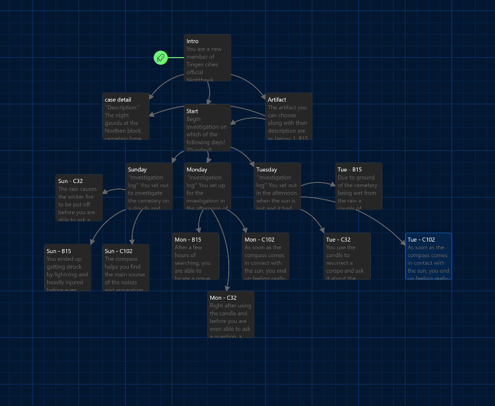
Here’s the link to my Twine branched story. It is short branched story on a newbie’s choices of artifacts to solving a supernatural case. Can you make the right choices? Newbie Supernatural Case
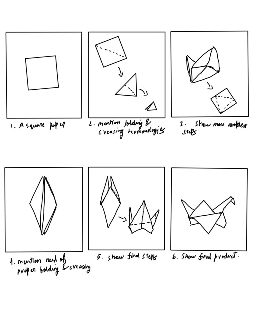
The following link is to my learning video on a tutorial to make a origami paper bird: Origami Tutorial
Here is the storyboard to my video above:
In one of my electives, a philosophy class that I took, the professor told us a story about how six blind men were made to touch different parts of an elephant. They each argued about what it was – a wall, a snake, a tree trunk, etc. While each were correct about their own parts, they were wrong as a whole. This helped me connect the impirtance of condensinsing multiple perspectives to see the whole picture in problem solving.
This story helped change how I approached problems, no matter if it was course related, disagreements, or team projects. It taught me to take and try to understand everyone’s persepective and every part of a problems value, even if they appear to contradict at first.
This particular story of touching an elephant’s trunk, legs, ears, etc envoked and effected my sensory cortex responsible for touch, as I felt my brain trigger false senses such as texture of an elephants skin.
The following are the storytelling techniques I found in the elephant story:
Overall I really enjoyed this week’s content and use of multimedia techs. I had never used or heard of Twine before and I found it really fun to use it to create branched story’s. It really helped stir my creative juices on a narrative. I hope you enjoyed the short hodgepodge of a story that I created. As for the video, it was definately a little out of my compfort zone as I tried not to involve screencasting in it. Not having a tripod to created quite the hassel of creating the tutorial where I needed to use both hands, so I could only build a makeshift one. It was also the first creative/learning content that I filmed by myself.
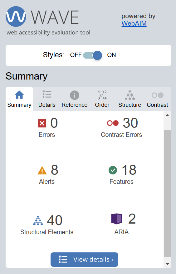
After running the WAVE accessibility report, I got the above. We can observe that there are 0 errors but 30 contranst errors, 8 alerts, 18 features, 40 structural elements, and 2 ARIA labels.
I actually expected there to be contrast errors and I was right as it can be seen that the gray fonted text in a white background of the default opened.ca site is a little lacking in contrast. I was suprised to see no accessibilty errors at all and just some alerts for potential errors as I hadn’t created my posts with acessibility in mind.
It can be seen that my posts are quite accessible, so they are only lacking when it comes to some design choices. Moving forward I will try to change the color theme of the site a little to improve contrast. I’ll also review the alerts to understand and make necessary improvments to avoid potential accessibility errors.

The above is an infographic I created using Canva on the topic of Fire Safety. I used the following design principles:
I have the following promising infographic design practices incorporated:
I found this module about inclusivity and design principles related to it very eye-opening. Also to enhance my knowledge on practical implementation of inclusivity and universal design, the WAVE report was every useful tool. It’s report helped me assess what what were considered a good contrast for proper readability and also its potential accessibility alerts helped me better my inclusivity design skills. It was my first time using Canva and I found it to be very intuitive, feature and customization extensive. It was very fun and almost to easy to create high quality infographics. I look forward to exploring it more. I created my infographics about ‘Fire Safety’ with a design that helps lead the viewers eyes through a linear progression of steps/information to better prepare people in case of a fire. I designed it in a way that confirms to many of infographics good practices while also making it eye-catching. I hope hear from the viewers about their initial impressions of it.
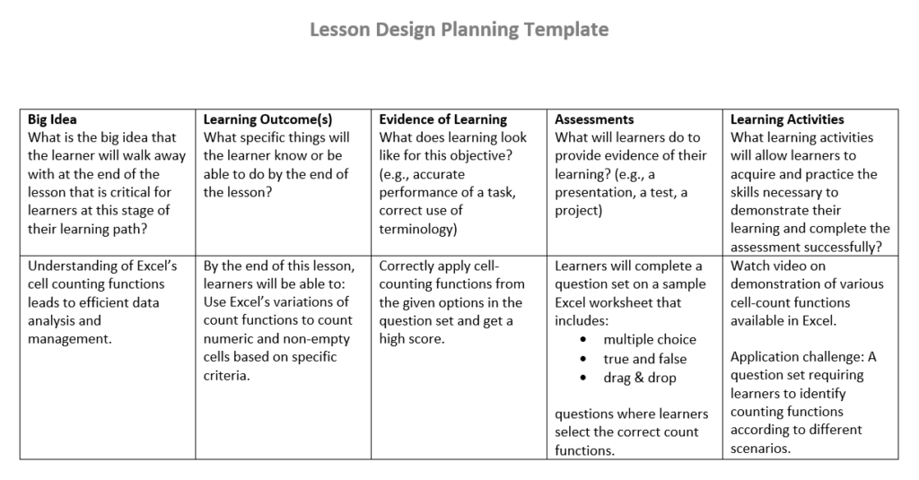
I have made my learning design on the topic of cell-counting features in Microsoft Excel.
This is a tutorial on some of the cell-count variations available in Excel:
Now following your study and walkthrough on Excel’s cell-count functions, the following is a question set to test you on it.
Reflection
I really enjoyed using H5P to create the question set for this post. It was a first for me in terms of using such a comprehensive tool. Not only was it very user-friendly, it was also varied in its repository. I personally have used multiple different websites or tools on the internet such as SurveyMonkey, Google forms and Kahoot to create only some of the activities in H5P’s expansive repository. As such I fould it really engaging when H5P as a free tool could cover them all.
I personally really like the drag and drop activity and would definitly utilize it extensively if I were to use it in a teaching context. For example, as a computer science student (as a teacher in this case), similar to how I constructed a question for an Excel worksheet, I could leave blanks in sections of code and have learners drag and drop the correct code line out of multiple options for specific outputs.
Some of the H5P activities are definitely more resource-intensive to create than others, typically because of their multimedia and interactivity requirements. Personally I think interactive videos are expensive to make. These usually involve embedding questions, pop-up notes, and links within videos, which requires the need for sourcing or creating high-quality video content and also carefully planning the interactions for enhanced learning.
AI generative image

“A jumping cat” prompt, Stable Diffusion Online, 11 Oct.2024, stablediffusionweb.com/app/image-generator/.

“A blackhole raven” prompt, Stable Diffusion Online, 11 Oct.2024, stablediffusionweb.com/app/image-generator/.
When given the option to generate anything using an Generative AI tool, I went with an image generator tool, Stable Diffusion. It was my first time working with this tool but thankfully the interface was very intuitive and user-friendly. As for what to generate, I wanted to work with a simple and an abstract image prompt. I followed this with description prompts for the generated images in ChatGPT.
The prompts I settled on and their description are as follows:-
When regarding image accuracy, I found the simple prompt to generate a very accurate image of a jumping cat with not much noise or deviations compared to my personal idea. As for the blackhole raven, it did differ quite a bit from my idea with it just being a raven and a black circle in the same image. However, that was to be expected since it was a very abstract or fantastical term. From this it can be seen that the LLM (Stable diffusion) has a knowledge bank that is heavily cluttered with existing ideas (bland and formulaic) from the internet but lacks the capacity of creativity.
Regarding description accuracy, I found the description for the cat to be very accurate if not excessively informative since I myself was only described it as “a jumping cat”. Whereas the blackhole raven description didn’t use the term blackhole at all. I believe this is due to the simple black circle with white interiors depicted in the image which can almost be described as a cosmic phenomenon.
AI generative text
I have written down the analysis provided by ChatGPT below:
———————————————————————————————–
To create a SAMR (Substitution, Augmentation, Modification, and Redefinition) analysis on the use of Perplexity, a generative AI tool, for learning, we can break down the tool’s application across each level of the SAMR model. SAMR is used to analyze how technology integrates into learning and can transform educational practices.
Here’s how we can analyze Perplexity in this framework:
At this level, technology acts as a direct substitute for traditional tools without any functional improvements.
At this level, technology provides direct tool substitution with some functional improvement.
Here, technology significantly redesigns the task, enabling learners to achieve outcomes that were previously impossible or difficult.
At this level, technology allows for the creation of new tasks that were previously inconceivable.
This SAMR analysis shows how Perplexity can progress from simply replacing traditional tools to transforming the learning process entirely.
———————————————————————————————–
“help me create a SAMR analysis on the use of a generative AI tool Perplexity for learning” prompt, ChatGpt, version 4.0, OpenAI, 11 Oct. 2024, chatgpt.com/
Regarding the things that are the hardest to assess from the above generated information would be regarding limits of Perplexity’s features and it’s impact on long-term learning. While it provides information on a few of it’s features clearly, it shouldn’t be the limit. Similarly, it only provides it’s immediate effect or transformations on learning, while having limited insight on long-term learning. The model tells us that this tool has the ability to enhance (Substitution & Augmentation) and transform (Modification & Redefination) learning. As for what it missed, it would be regarding ethical or bias concerns which depends on the knowledge bank used by the tool. It also doesnt give any information on it’s generation and information accuracy.
I have been using AI tools, especially ChatGPT for quite a while now. With enough frequency to know its strength and weaknesses. I have seen it’s usefullness and higher accuracy mostly when I prompt shorter questions or for shorter sections of code. I mostly use it when I dont understand some terms or I want it to go through my code to check what I did wrong. But I also know that it is really bad when it comes to heavy mathmatical calculations. For example, when working with boolean algebra simplification problems, it sometimes downright gives a wrong answer when the equation is to long or complicated.
I think that AI technology has especially bloomed over the past few years and we have seen constant development around it. So, while 2-3 years seems short when we talk about innovation, I believe that these tools will only become more comprehensive in their generation, be it from updating of their knowledge bank or stronger machine learning technology. I also know the growing fear of AI tools replacing human labour, but I believe that on a more positive note that AI tools will focus more on enhancing human creativity rather than replacing it.
In the past week, I created a multimedia learning content in through screen casting. I used PowerPoint screen recording to record a video on “Introduction to HTML” explaining basics of HTML and how to create structure of a web page. It aslo describes some important but basic terminologies used in HTML. The following is my screencast:-
Principles of Cognitive Theory of Mutumedia utilization :-
I have presented my screencast in a way that minimizes extraneous overload while also streamlining the intrinsic overload of information. I followed the redundancy principle where I avoided unnecessary texts for the knowledge I provided. Other than labels (e.g tag names or key terminologies), everything else was explained through only visuals and narration. I only utilized the signaling principle, where I utilized either a laser pointer, mouse cursor or labels to pinpoint the key information. All of the above help learners avoid use of avoidable cognitive resources to find essential materials or discern important information.
To streamline intrinsic or novel knowledge, especially for first time learner for the topic of HTML/web page creation, I applied pretraining and modality. For new learners to handle new novel information, I allocated certain time to explain terminologies (e.g. tags, elements, attributes) that may be used in the following content. While I also utilized images (i.e HTML scripts) and narrated their use in creating a web page while avoiding showing words and sentences of definations.
I actually found segmenting more difficult to implement for this particular screencasting. Although my initial idea was show the code line by line from a blank state to completion while sxplaining them, it was much harder to implement it in a way where I could speak clearly, concisely and confidently without stuttering. Hence, I opted to show almost the full code while explaining them line by line.
Impact of audience for the screencast
I imagined my audience to be students from Highschool level to undergardauate that never got into web developement or HTML. Imagining this, I tried to implement my screencasting in a way that I felt I myself would have found easier to understand. Hence, I tried to keep it conscse and focused more on visuals and practicality (HTML coding) than theory. My only dissapointment was a lack of proper segmenting technique.
Conclusion
In conclusion, this activity was an interesting endevour for me as I learned how challenging it could be to utilize the principles of Cognitive Theory of Multimedia to create effective learning content for new learners. But it was also very interesting and mind-opening how complex knowledge gathering and processing could get.
Please answer the following questions in this document for your first introductory blog post in preparation for your initial team meeting with your Learning Pod. This information will allow your team members to get to know how you work best so that the group can make team agreements that work for all.
What is your preferred mode of remote communication?
I prefer using discord or instagram
What are your communication strengths?
I can speak English clear and concisely
What are your communication weaknesses? Where would you like to grow?
Although I have no problem with speaking and understanding English, as it’s not my first language, I sometimes do mess up pronunciations.
I would love to increase my proficiency in word pronunciations.
Do you consider yourself an introvert or extrovert?
Somewhere in between. I don’t like to be too active or take initiative for activities but I do like to make friends
What time zone are you in?
I’m in the Pacific Daylight Saving Time zone
What time of day do you prefer doing academic work?
During the evening or before midnight
When you are upset do you tend to share this with others or keep it to yourself?
If it will affect my health or thinking ability too much, then I would refer to others. Otherwise no.
What do you like about group work?
Having the chance to exchange ideas and recieve feedback
What don’t you like about group work?
I dont like it when any of the groupmates can’t complete their work before the due dates (i.e if they dont have any relevent excuses).
What else would you like your team to know?
I’m excited about working with all of you and I hope we can communicate and co-ordinate well during assignments.
© 2026 EDCI 337 Fall
Theme by Anders Noren — Up ↑
Recent Comments