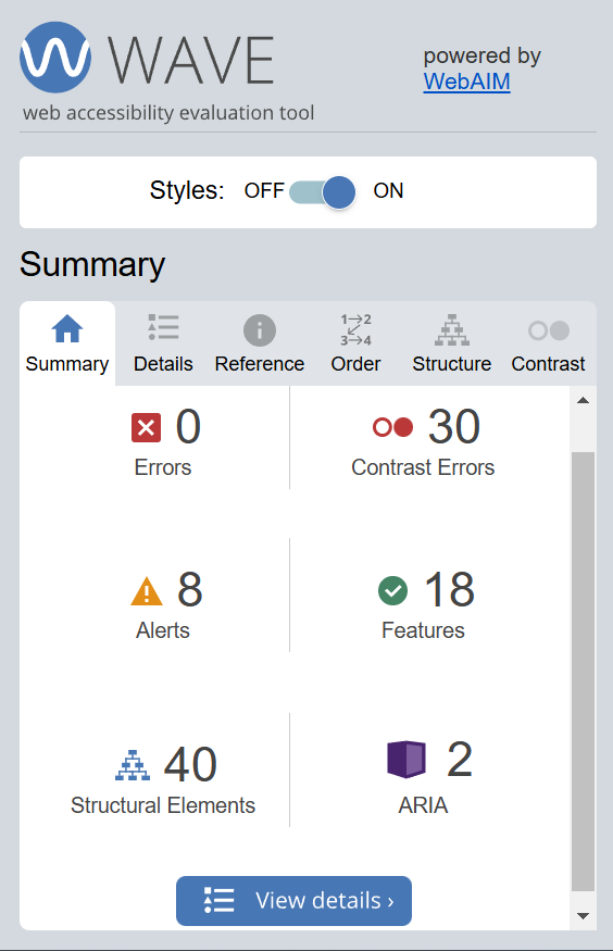
After running the WAVE accessibility report, I got the above. We can observe that there are 0 errors but 30 contranst errors, 8 alerts, 18 features, 40 structural elements, and 2 ARIA labels.
I actually expected there to be contrast errors and I was right as it can be seen that the gray fonted text in a white background of the default opened.ca site is a little lacking in contrast. I was suprised to see no accessibilty errors at all and just some alerts for potential errors as I hadn’t created my posts with acessibility in mind.
It can be seen that my posts are quite accessible, so they are only lacking when it comes to some design choices. Moving forward I will try to change the color theme of the site a little to improve contrast. I’ll also review the alerts to understand and make necessary improvments to avoid potential accessibility errors.

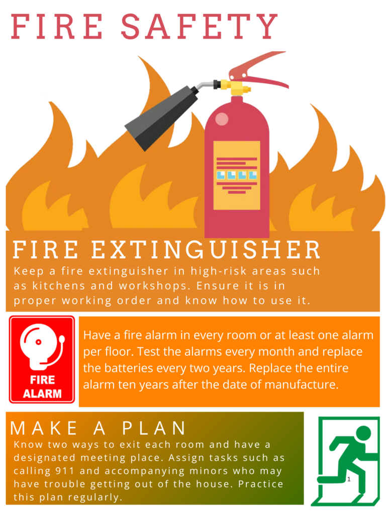
The above is an infographic I created using Canva on the topic of Fire Safety. I used the following design principles:
- Alignment: I have maintained a clear alignment between text and the corresponding visual elements, which aids readability and visual flow.
- Hierarchy: The main parts such as ‘Fire Extinguisher’, ‘Fire Alarm’, and ‘Make a Plan’ stand out as section titles, with larger font sizes and bolder colors. This hierarchy helps direct the viewer’s eyes through the infographic logically.
- Contrast: I have made the constrast significantly visible through my color choices. Here, text colors are in bold white which differ significantly from the darker shades of background colors of each element.
- Repetition: I have used a consistent color scheme consisting of shades of orange, red, and a trailing green and icons across each section that strengthens cohesion.
- Proximity: All related elements of a section such as text and relevent images are kept together, signifying to viewers the proper segmenting of standalone data.
- Balance: I have balanced my design with proper spacing of sections, icons, and text blocks. With each section occupying similar space with consistent margins and spacing, creating a harmonious and stable layout.
I have the following promising infographic design practices incorporated:
- Limited color palette (Orange, Red, Green(trailing))
- Simple imagery (Straigtforward Icons)
- White space (Proper white space between components)
- Font quantity (Only used Open Sans font)
Reflection
I found this module about inclusivity and design principles related to it very eye-opening. Also to enhance my knowledge on practical implementation of inclusivity and universal design, the WAVE report was every useful tool. It’s report helped me assess what what were considered a good contrast for proper readability and also its potential accessibility alerts helped me better my inclusivity design skills. It was my first time using Canva and I found it to be very intuitive, feature and customization extensive. It was very fun and almost to easy to create high quality infographics. I look forward to exploring it more. I created my infographics about ‘Fire Safety’ with a design that helps lead the viewers eyes through a linear progression of steps/information to better prepare people in case of a fire. I designed it in a way that confirms to many of infographics good practices while also making it eye-catching. I hope hear from the viewers about their initial impressions of it.
Recent Comments