
Assgt 3: Rich Multimedia Lesson
By Group D:
Members: Liam Calder, Swoyam Rajbhandari, Serena Sing, JungJoo Yoon
Overview
Hello everyone! This week, we will dive into the topic “Basics of Python Programming”. It is an essential building block for anyone who is new to Python coding. Our lesson covers the following:
- Python history and its applications.
- Fundamental Python data types.
- Programming constructs such as loops in Python.
We have prepared many learning materials, activities, and quizzes that will help solidify your knowledge of basics of Python programming by the end of this lesson!
Lesson Plan
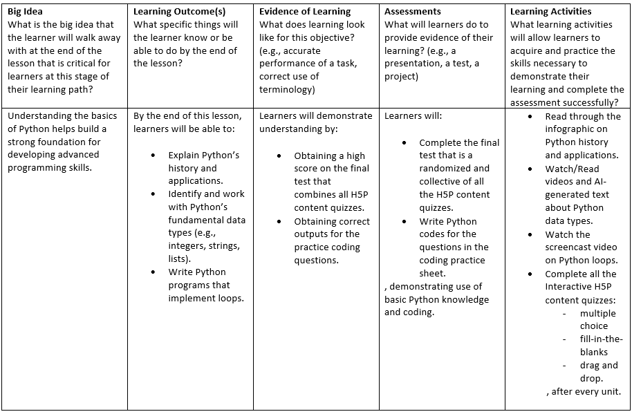
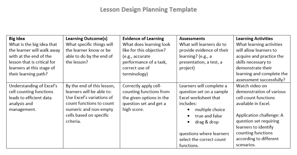
The following is the lesson plan we created as the format for our lesson:
Read/Watch
Introduction on Python (Infographic)
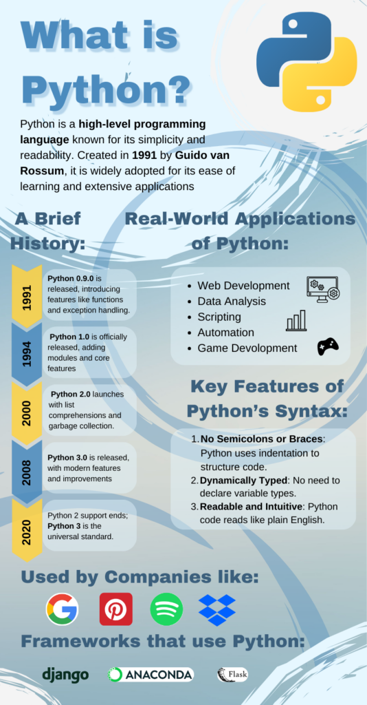
The following is an infographic on an introduction to Python, its history and features, and applications:
Now that you have gone through the infographic, let’s do a short activity that will test you on what you have learned so far.
The following is a multiple-choice quiz on the content so far:
Data Types
The following is a video on Python Data Types:
Telusko. “#10 Python Tutorial for Beginners | Data Types in Python.” YouTube, 5 July 2018, www.youtube.com/watch?v=gCCVsvgR2KU. Accessed 29 Nov. 2024.
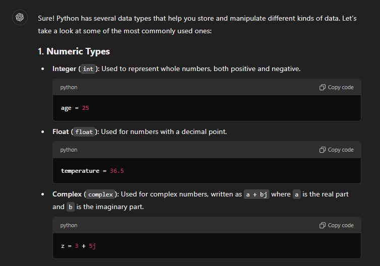
The following is AI-Generated text using ChatGPT on Python Data Types, based on the prompt, “Explain python data types for beginners”. It provides information on Python Data Types.
“Explain python data types for beginners” prompt. ChatGPT, 29 Nov. version, OpenAI, 1 Dec. 2023, chat.openai.com/chat.
Example Code:
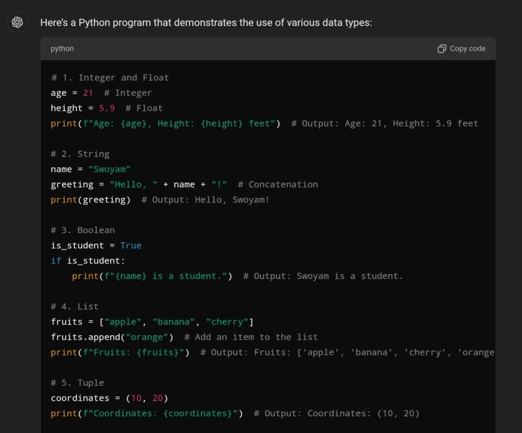
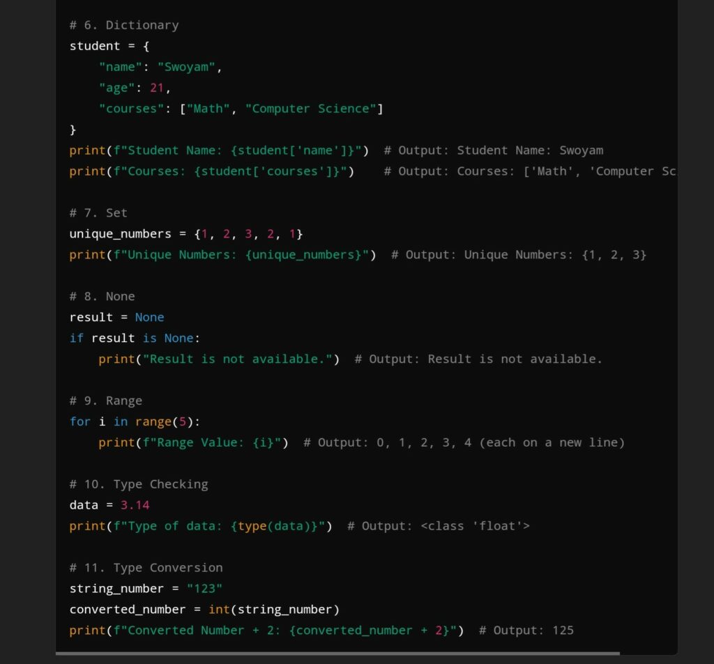
The following is AI-Generated text using ChatGPT on Python Data Types, based on the prompt, “Show me code that provides an example”. It provides example code for Python Data Types.
“Show me code that provides an example” prompt. ChatGPT, 29 Nov. version, OpenAI, 1 Dec. 2023, chat.openai.com/chat.
Now that you have gone through the videos and texts, let’s do a short activity that will test you on what you have recently learned.
The following is a multiple-choice quiz on the recent content:
Python Loops (Screencasting)
The following is a video that introduces Python loops, their functions, applications, and how they work:
Now that you have gone through the screencast video, let’s do a short activity that will test you on what you have recently learned.
The following is a multiple-choice quiz on the recent content:
Self Reflection
Please reflect about the following questions:
- How did you find your first impression of Python to be? Were you suprised about its history and different applications?
- Where you able to understand the differences between the data types? Do you think they complement each other?
- How do you feel about Python Loops? Are you able to differentiate between For and While loops while also understanding in which circumstances to use which?
- Overall, how well have you understood the content? Can you apply the knowledge you have gained to write simple code?
To Do Activities
- Read through the infographic on Python History and Applications.
- Watch/Read videos and AI-Generated text about Python Data Types.
- Watch the screencast video on Python loops.
- Complete all the Interactive H5P content quizzes:
- multiple choice
- fill-in-the-blanks
- drag and drop, after every unit.
Final Test
The following is the final test for this lesson, encompassing all the units learned so far. Please note that you will be unable to return to the previous questions or check the answers untill the end of test.
Good luck!
Grade scale:
- 90 – 100: A+
- 80 – 89: A
- 70 – 79: B
- 60 – 69: C
- 50 – 59: D
- 40 – 49: E
- 0 – 40: F
The following is a Python Coding Sheet containing multiple coding questions. Please follow the provided instructions carefully and make sure that your code generates the correct outputs.
Theories, Principles, and Techniques used for this Lesson
Principle of Learning Design
Instructional Design:
We have utilized principles of learning design: We have utilized the core of Instructional design which consists of a series of planning decisions, also known as the lesson plan. In creating this lesson, we have implemented constructive alignment and backward design:
- Constructive alignment and Backward Design: They were done through strongly aligned content and designs with respect to learning outcomes, assessments, and activities. We began by writing our envisioned learning outcomes, then planning our assessments to determine how learners would achieve those outcomes. Finally, we created learning activities to support learners in completing the assessments. This forms out complete cycle for this lesson. This can we seen in how closely aligned our three components are (learning outcomes, assessments, and learning activities). For example, one learning outcome involves identifying and working with Python Data Types, for which we created the fill-in-the-blanks quiz and a follow-up coding sheet as assessments. To prepare the learners to perform well in the corresponding assessments, we have created videos and AI-generated texts to teach them the required knowledge. By the end of this lesson, learners will hopefully be able to identify and work with Python Data Types.
Active Learning/Passive learning:
Our learning materials primarily convey passive learning, as they focus on the “Basics” of Python. As named, it is tailored around audiences that are beginners or initial learners, some of who may have no prior experience with coding. For such learners, it is crucial to create a foundation of the basic knowledge, enabling them to progress towards areas where active learning is implemented.
Ofcourse, foundational knowledge can only do so much. As such, we have prepared for Active learning strategies too. For example, we provided engaging activities such as coding questions that will help develop problem-solving skills. In line with Bloom’s Taxonomy, we structured the lesson to move from basic understanding to application and analysis.
Merrill’s First Principle of Instruction
It is one of the most effective learning theories from an active learning deisgn perspective. We created infographics to help learners quickly grasp/activate foundational knowledge, while also referencing prior knowledge that act as building blocks for more advanced topics (For example, the information on Python features/syntax). We included videos that demonstrate Python coding through outsourced videos and the screencast we created. These videos provide real-world coding problems. Making it easy for learners to follow along, modifying their code along the way to see what works and what doesn’t. Afterward, the learners are able to apply the knowledge by either completing the H5P interactive contents or doing the coding sheet. Finally, they are able to integrate the newer and more advanced knowledge into their mind.
Principles of Multimedia Learning
- Coherence Principle: We focused on essential information, avoiding unnecessary elements in the infographics, which were solely focused on Python history, features, and applications. Similarly, for the AI-generated data types, we used very concise prompts to generate very concise yet relevent answers. Hence, the content are coherent and relevent to avoid overloading learners.
- Segmenting Principle: We divided the contents into smaller sections, breaking down the big idea into smaller components and gradually building them up. For example, we divided content for each data type rather than showing a full code with multiple data types used altogether. Similarly, the screencast for loops started with basic and smaller components and gradually progressed to larger and more complex applications.
- Modality: By combining visual code demonstrations with verbal explanations, rather than just labels and a diagram, we were able to cater to different learning styles.
Infographics Design Principles
For the infographic, we applied several key design principles, such as repetition, alignment, and hierarchy. Repetition tied the design together. we attempted to do this with consistent use of colors, fonts, and spacing. We made sure to stick to two different fonts and used the Python logo colors. This helped make everything look more cohesive. We used alignment to ensure a clean and structured layout. We also utilized the hierarchy design principle by increasing the font size to direct attention to important sections, such as the title and different sections of the infographic.
Universal Design for Learning
This project showcases the principles of Universal Design for Learning (UDL) by presenting our lesson in a variety of formats and media that are able to address a broad spectrum of learners’ preferences and needs. The lesson integrates various supplementary materials: a a Canva-based infographic, YouTube video, ChatGPT-generated texts, an OBS-engaged screercast, and multiple H5P interactive quizzes (multiple-choice, fill-the-space, drag-and-drop, etc.), all of which contribute to different means of engagement, representation, and action/expression. All of these elements, incorporated into blocks of a WordPress blog, foster an integrative setting. Such an organization allows for ease of access as learners can opt to watch, read or interact with the content Learners. Allowing them to also adapt content through appropriate means:
- visual learners use the infographic and modern contemplation of screencast.
- auditory learners have the screencast and videos’ voice explanation. They can also use text to speech/screen readers such as Read Aloud to make it more accessible for people with hearing impairments.
- kinetic learners perform H5P quizzes actively.
Through these multiple components, our lesson focuses on the material to be both accessible and interesting to learners of different abilities, prior knowledge, learning styles which enhances equity and inclusivity in education.
Discussion
We utilized WordPress as the platform to post our lesson in the format of a blog. Through online discussions and chats, we were able to divide and delegate the different components of our lesson. We made these delegations based on our expertise, interests, and the lesson plan design. We also adhered to the various principles we learned throughout the course as closely as possible.
The following are our individual contributions:
Swoyam: He contributed by managing the timetable, project format, and assessment section. He set up the basic schedule and guidelines for the team members such that we could complete our sections of the work in time while also working together to generate a cohesive and complementary learning material/lesson. He also built multiple H5P contents through the H5P content plug-in to create multiple assessments such as multiple choices, fill-in-the-blanks to drag & drop, and the coding sheet. They can help learners hold self-assessments on their understanding of the various corresponding as certain learning materials are made available and as assessments to provide their evidence for learning.
Liam: He contributed with a screencast on loops in Python. It is meant to introduce the fundamental concept in programming that allows code execution multiple times. He wanted to show loops in different formats while keeping the application the same to demonstrate how each loop functions and how they work. He didn’t go deep into how one could apply them for more complicated programming, but he focused on how they function at a fundamental level. So he helped structure the learning outcome for learners to undertand what loops do, how to set them up, understand them, and then apply them to simple data structures.
Serena: She contributed by creating a Python infographic using Canva. The infographic highlights Python’s history, applications, and syntax, in a more visually appealing way. Her goal was to create an infographic that provided a basic knowledge of Python to ease learners in and spark their interest in the language. What learners will take away from this infographic is an understanding of what Python is, how it can be used, it’s history, and why it would be a worthwhile programming language to learn.
Scott: He contributed to the project by focusing on Python’s data types. For my part, he used AI tools to create simple and clear explanations of Python’s basic data types, like integers, strings, and lists. He provided code examples to show how these data types work in practice along with the explanations. These examples included creating variables, performing basic operations, and using lists effectively. So he helped structure the learning outcome for learners to understand Python Data types, what they do, how they work, and how to implement simple Python code with them.
References
“Explain python data types for beginners” prompt. ChatGPT, 29 Nov. version, OpenAI, 1 Dec. 2023, chat.openai.com/chat.
“Show me code that provides an example” prompt. ChatGPT, 29 Nov. version, OpenAI, 1 Dec. 2023, chat.openai.com/chat.
Telusko. “#10 Python Tutorial for Beginners | Data Types in Python.” YouTube, 5 July 2018, www.youtube.com/watch?v=gCCVsvgR2KU. Accessed 29 Nov. 2024.



Recent Comments